Journey’s unleashed ui/ux design project
This project simplifies booking and travel for adventures and essential needs within South Africa.
Tailor Made For Adventurers
wireframing my ideas to show consistency
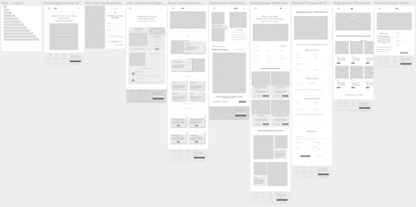
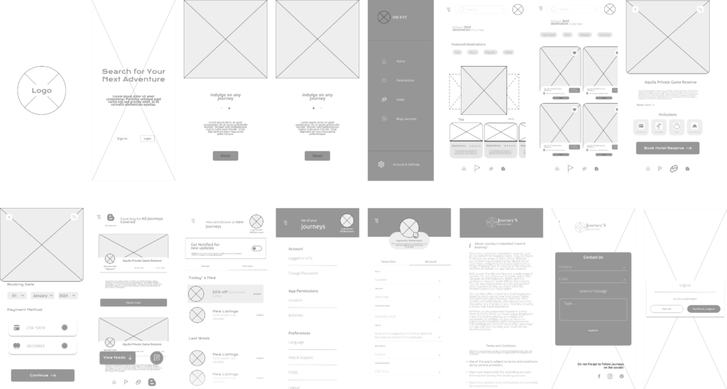
Page wireframes use shapes and text placeholders to define whitespace, improving usability and clarity by focusing on page layout.
Web-wireframing
mobile-wireframing
Wireframing is the initial skeletal blueprint for any UI/UX design project. I used Figma to create a greyscale plan, envisioning the website by building each page’s elements and layouts for later component sets.
UI referencing
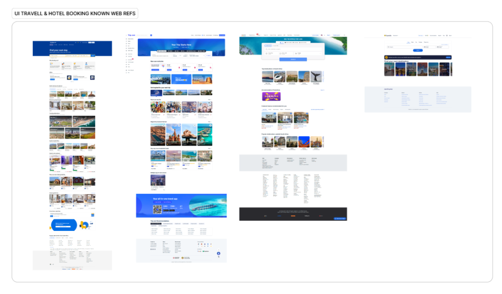
Leveraging existing web and mobile dynamics is crucial for automating a consistent and well-implemented user experience.
The UI component sets
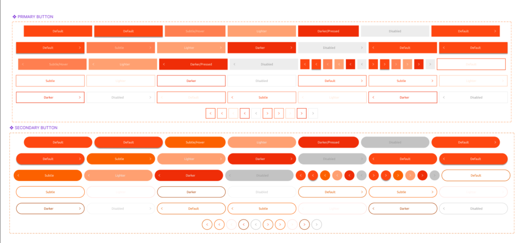
Buttons play a vital role in the navigation and comprehensive understanding of a design system. They are indispensable elements for both exploring the system’s various facets and meticulously documenting its components and principles. The implementation of buttons is a deliberate process, with their purpose and placement thoughtfully evaluated to guarantee a uniform and coherent experience. This careful consideration ensures that each page and interaction within the design system offers consistent guidance and fulfills a specific objective. The decisions regarding button usage are firmly grounded in practical experience, stemming from thorough prototyping phases and the realities of the development process. This iterative approach allows for fine-tuning and optimization, leading to a robust and user-friendly design system where buttons serve as reliable navigational aids and clear indicators of intended actions.
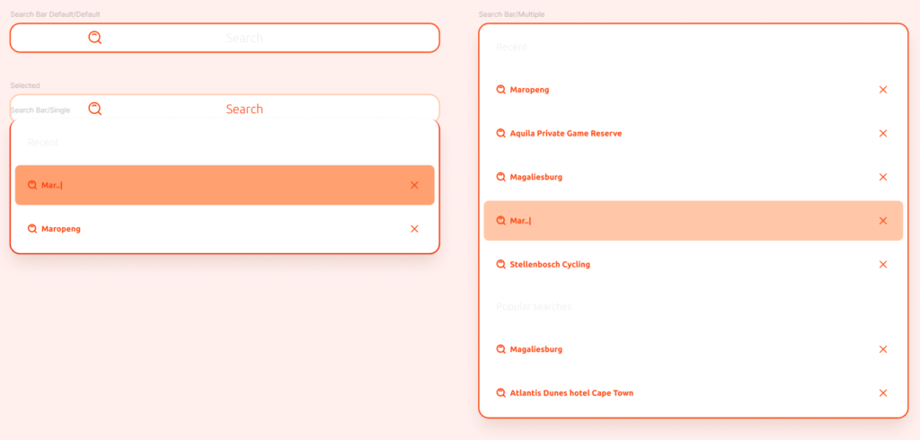
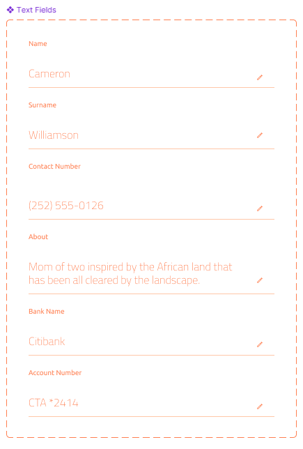
The text fields and forms have been carefully developed with a strong focus on usability, ensuring a smooth and intuitive experience for users. This design emphasis is particularly evident when users are engaged in booking accommodations, allowing them to easily specify and confirm their hotel preferences. Similarly, the usability considerations extend to the search functionality, enabling users to efficiently input and refine their criteria when looking for hikes that match their desired characteristics and requirements.
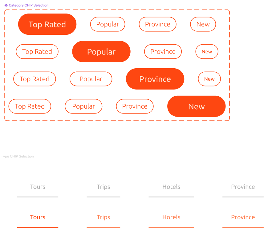
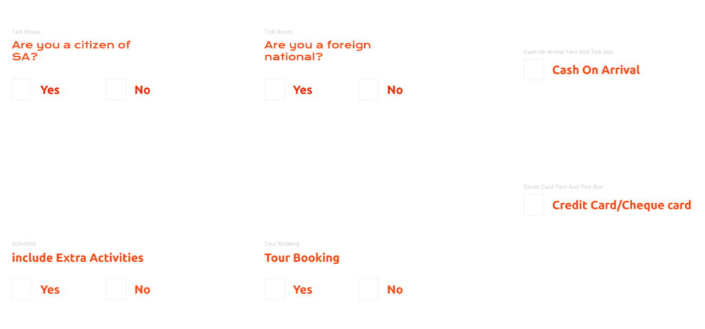
User interface elements such as radio buttons and click buttons play a crucial role in improving the usability of websites, especially when it comes to secure and efficient data entry processes that users encounter regularly. These elements streamline the way individuals interact with online forms and interfaces, making it easier to input information accurately and quickly. By providing clear and intuitive options, radio and click buttons contribute significantly to a more user-friendly web experience for everyday tasks.
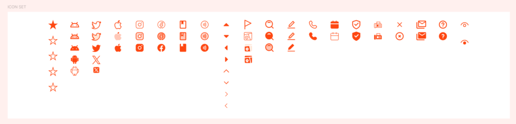
Iconography offers a versatile and adaptable design system library, carefully constructed to provide a range of benefits. This system includes a selection of complementary icon sets, designed to work in harmony with one another. The purpose of these icon sets is to ensure icons are used correctly and consistently. This correct and consistent application extends across both web platforms and mobile platforms, guaranteeing a unified and professional look and feel for users, no matter how they access the content. Proper usage and placement are key to maintaining visual integrity and brand consistency.
Branding the project
The project utilized both Canva and Figma. Canva was initially used for branding discovery, leveraging its diverse graphics and text options to inform the UI design in Figma.
The logo design was implemented in Figma for UI/UX design, with specific scaling guidelines for iconography and web usage.
Visual identity
The visual identity relies on both colour and typography as fundamental elements. These elements are strategically enhanced through the application of visual hierarchy, which guides the viewer’s eye and organizes information effectively. Furthermore, colour harmony is employed to create a cohesive and aesthetically pleasing experience. These carefully considered aspects of colour, typography, visual hierarchy, and colour harmony work together to inform and guide the specific guidelines that have been selected for the visual identity.
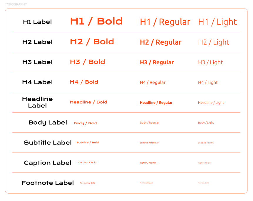
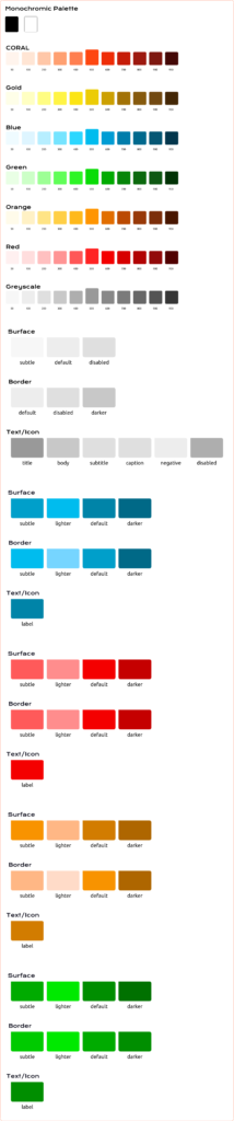
The final Ui designs
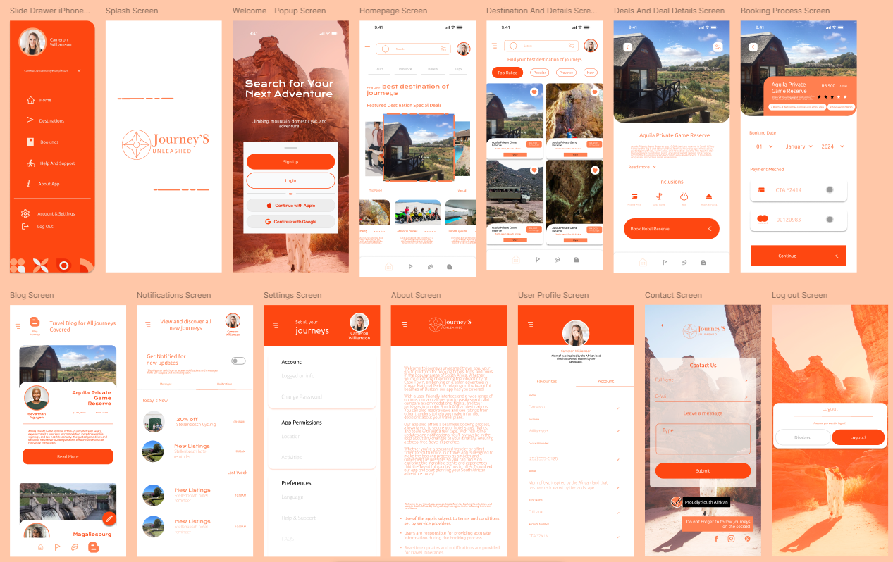
This project’s UI/UX, showcased on Behance, is exceptional and effectively meets user needs while reinforcing brand identity. It aims to connect with adventurers interested in exploring Africa, particularly South Africa.
&

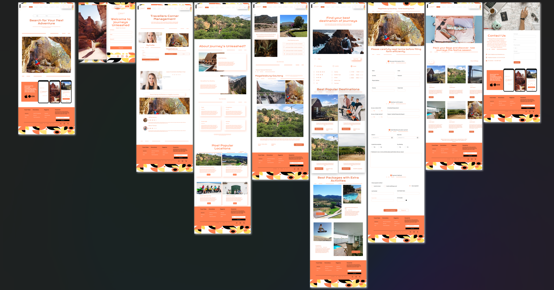
Web-Final pages